This is a comparative review of the physical and digital versions of the National Museum of American History’s exhibition, “FOOD: Transforming the American Table 1950-2000.” There are some photographs of the physical space here and the digital exhibition is here.
The physical exhibit occupies a U-shaped spaced. There are two entrances: one is through the Julia Child’s kitchen exhibit, but the other entrance is where the FOOD sign is located. There are four segments to the physical FOOD exhibit: Julia Child’s Kitchen, New and Improved!, Resetting the Table, and Wine for the Table. The exhibit is fairly small and was easy to navigate. It seemed to encourage two different flows of traffic, beginning at either of the entrances, flowing around the U and then out. There is a very long table running the length of the U that you have to walk around, so cutting across the U is not really possible.
It interesting to think about who the primary audience for this work is, since it is run by the federal government and is a major tourist attraction. I would probably contend that its intended audience, unlike most museums, is actually the broadest definition of “the public.” When I visited the exhibit on a weekday morning, the visitors were primarily tourist families (I got there before the museum and waited outside with many of them. From their conversations, it was clear they were visiting D.C. from elsewhere). There were some adults without children and what looked like a high school class as well. There were no curators, interpreters, or docents in the space, but a tour briefly came through and only looked at Julia Child’s kitchen.
The exhibit seeks to represent the chronological history of food in the United States between 1950 and 2000 along four different axes: technological innovation, social and cultural change, wine production in California, and the career of Julia Child. Each of the four sections, which are physically separated, moves in a more or less chronological, but also thematic, fashion. Each of the four sections is broken into more specific topics. The exhibit spaces consist of glass cases that contain artifacts (machinery, clothing, etc.), photographs, and print materials (magazines, instructions, etc.). Beneath the cases are panels that include narrative summaries of that particular topic, captions for the items in the cases, and reproductions of photos, ads, and articles. As you walk through the exhibit’s sections, you move forward through time, and eventually end up in the present. The captions and narrative are written in objective, authoritative, textbook voice, although this is countered by the types of items that are included in the exhibit. Most of the items are ephemera or would even have been seen as garbage: a tortilla bag, a Chianti wine bottle turned into a candleholder, a styrofoam Big Mac container, a lap mat from In-and-Out Burger, ads for cellophane and Cheez-Whiz, and my personal favorite, disposable cup lids (I love that they’re cataloged). This tension between the mundane and the monumental is something I always notice at the NMAH. This exhibit leans toward the artifacts of everyday life, with the exception of Child’s Kitchen (which is definitely monumental, even in how it’s encased in glass), and I think encourages visitors to revisit and reconsider how the things they use and see everyday fit into the narrative depicted by the exhibit.
There are also three multimedia pieces within the exhibit. One is in the Child’s Kitchen segment, and shows clips from her show as well as from a documentary about her life. One is in the New and Improved! section, and shows historical ads, news, and other television programming. The final is in the Wine for the Table section and is a recent documentary/oral history of the wine industry in California. There were not interactive elements in the physical space, although I do think there is sometimes programming at the long table in the middle of the exhibit. There were lazy susans embedded in the table that described the history of school lunches, but nothing was going on when I visited.
I do think more interactivity would make the physical exhibit more effective, but I’m not sure what the form of that would be. There was a lot of reading, and I noticed that some of the younger children weren’t super interested. To get at the idea I mentioned above, thinking more closely about items we use everyday and our own food/eating practices, there should be some way for visitors to add thoughts or memories – verbal, visual, even artifactual. I also would have liked to have seen more multimedia elements, like commercials or ephemeral films. I know there are licensing issues with some materials, but the Prelinger (and Internet) Archive have items that would enhance this exhibit.
The digital exhibition of FOOD duplicates the structure of the physical exhibit. It has the same four sections, but they are listed in a specific order: Child’s Kitchen, New and Improved!, Resetting the Table, and Wine for the Table.This is not the order the U-shaped physical exhibit encourages visitors to follow (i.e. Kitchen, New, Wine, Resetting, or Kitchen, Resetting, Wine, New). The intended audience is the same broad public of the physical exhibit, but also includes people who cannot travel to D.C. and possibly even people in other countries, since this site can be seen as offering an official narrative about American history. The digital exhibition is very text-heavy, and that text is only in English, which does seem to indicate that the assumed audience is American (and not Americans who primarily speak other languages). It is also not really accessible to younger children, given its reliance on text.
The site is laid out in four sections, each with subtopics that correspond to the subtopics in the physical exhibit. It is easy to navigate; click into a section and then move backward or forward among the subtopics within that segment. You can also start at the beginning and click through all of the segments in a very linear way. There are occasional digressions on each page, like a link to see all of the 7-11 cups on this page, and you can bounce between subtopics within a section, but you can’t bounce between subtopics in different sections, since once you click on a specific section, the only navigation is within that segment. This is little like encountering and having to walk around the long table in the physical exhibit.
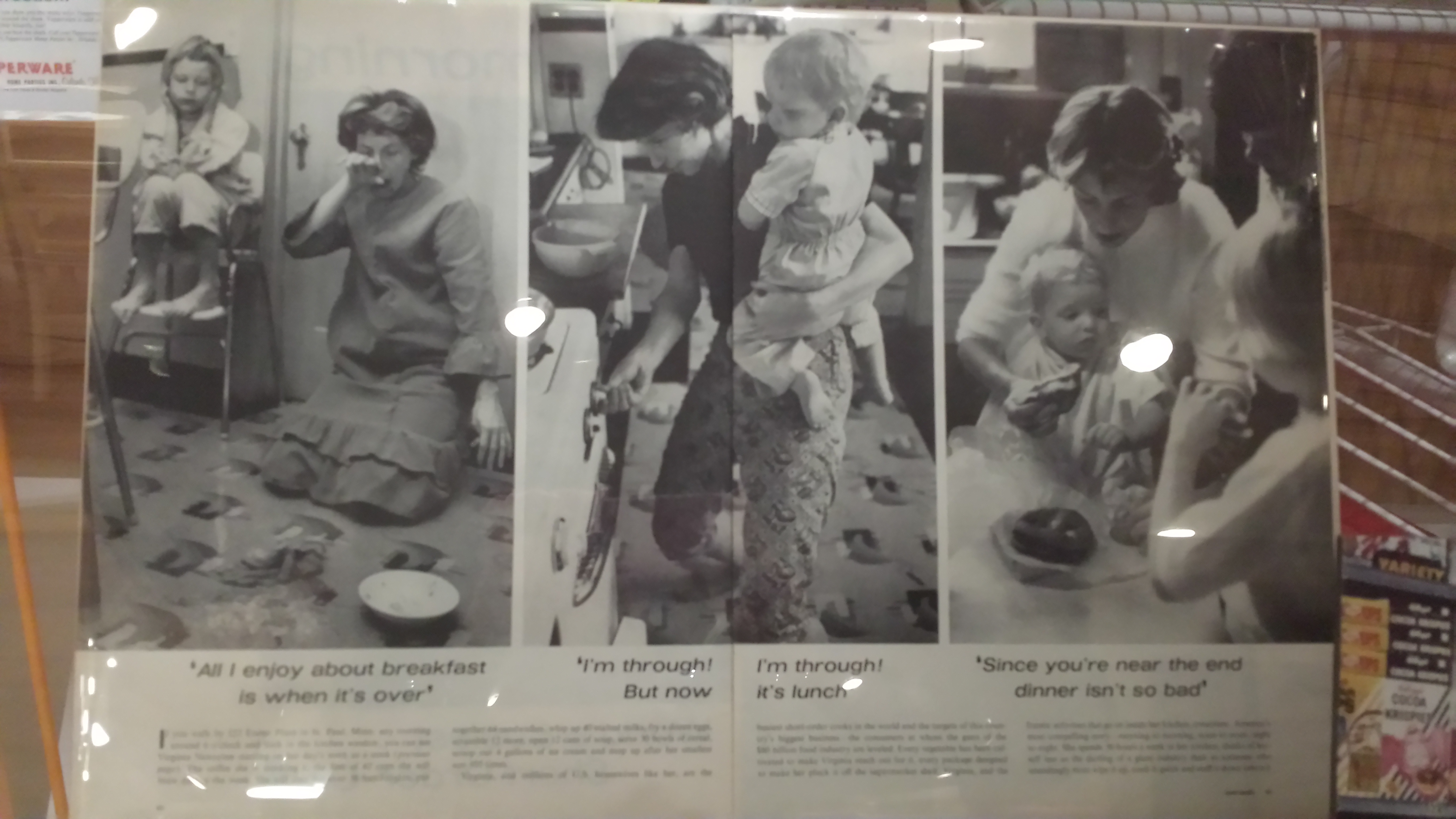
The subtopics within each section follow the panels in the physical exhibit. The page for each subtopic in the digital exhibit includes pictures of some, but not all, of the artifacts, photographs, ads, etc. in the glass cases of the physical exhibit. One of my favorite items, an ad about how boring and depressing it is to cook three meals every day (crappy phone picture below), is not included in the digital exhibit.
The digital exhibit also did not include the reproductions of related materials that appear on the panels in the physical exhibit, or any of the multimedia elements. However, the digital exhibit of Child’s Kitchen actually included more items than were in the physical exhibit, such as a picture of her Emmy Award and Emeril Lagasse’s chef’s jacket. I can’t decipher the rationale behind these inclusions and exclusions.
Although the panels in the physical exhibit stressed moving forward in time, in some ways the glass cases, which included numerous materials clumped together rather than in some sort of order, pointed to the messiness, overlapping, ongoing, recursive quality of history. The digital exhibit feels much more linear in its narrative. The career of Julia Child encapsulates the ways in which food has changed since 1950; here are the technological innovations; here are the cultural and social changes; and here is one example of how all of this plays out in one industry. The text on the pages of the digital exhibit and the captions of the items seems to be the same as the physical exhibit, so this narrative emerges primarily from the organization of the digital exhibit. Because the digital exhibit has the same types of items, if not the exact same items, as the physical exhibit, there is also that tension between the monumental and mundane here. The digital exhibit, though, I would argue, pushes more towards the monumental; there is more about celebrity chefs than in the physical exhibit, and rather than seeing all of the cup lids in their uniqueness, we see one, with a link to others (I am very taken with the cup lids).
Like the physical exhibit, the digital site does not have participatory or interactive elements or opportunities to interact with the site’s creators. Adding these elements would be one of my recommendations for improving the digital exhibit: a forum, a space to submit reflections/memories, a way to submit artifacts or oral histories like the Bracero Archive, etc. This exhibition seems appropriate for these forms of engagement, since it deals so much with everyday objects and practices. Another way to improve the digital exhibit would be through multimedia (commercials, etc.) and perhaps links to related resources for those who wish to explore the topic more deeply (books, articles, websites like the NYPL’s menu collection, etc.).