Category Archives: Tools

What Can You Do with Crowdsourced Digitization?

In answer to the question in the title of this blog post, you can do a whole lot with crowdsourced digitization. Members of the public can transcribe manuscripts and archival materials (as in the Papers of the War Department and Transcribe Bentham), correct incorrect OCR (as in Trove newspapers), and verify shapes and colors on historical maps (as in Building Inspector). They can also do thing like add tags and comments to materials, which helps make them more findable to other users. Trove offers this to members of the public and so do other projects such as Flickr Commons, which I use a lot for historical photographs.

The types of projects and tasks that seem likely to attract contributors are those that appeal to their interests. In the case of Trove, primary contributors are most interested in family and local history and genealogy. In the case of Transcribe Bentham, frequent contributors were interested in Bentham or history and philosophy more broadly. Main contributors to the Papers of the War Department were similarly interested in American history. These tasks and projects also let contributors feel like they are giving back, that they are contributing to something larger and possibly of historical significance.Building Inspector is somewhat different; it seems more like the sort of task that contributors would do while standing in line or waiting for the bus (and since it’s optimized for mobile devices, I imagine they were). Because the New York Public Library is asking for help, though, I suspect that it would still be seen as altruistic or as helping out with a larger, more important project, similar to the ways in which these other projects are perceived by contributors to them.

Based on my experiences contributing to the Papers of the War Department and Trove, having a wysiwyg and easy-to-use interface is crucial. This is particularly true of the Papers of the War Department, since I had to expend a significant amount of brainpower on reading eighteenth century handwriting. Essentially, the interface can’t stand in the way of the contributor. In terms of community building, it does seem to be helpful to have some sort of community, although that can manifest in different ways. The Trove forums seem to be quite active and a good resource if you’re not quite sure what you’re doing. The Papers of the War Department has basically a conversations tab for each document, on which you can ask questions about the item you’re transcribing. The community of Transcribe Bentham used to be moderated, which was extremely effective but also labor-intensive; now there is a scoreboard, which I’m guessing does some of the same community-building work, but to a lesser degree. The community around Building Inspector is more implied – the same images are shown to three people – but it’s reassuring, as it lets you know that you won’t ruin something.

There is one aspect of crowdsourced digitization that hasn’t come up, and that is its labor politics. Several project creators/managers indicated that their motivation for crowdsourcing transcription and other work is because their institutions will never have the ability to pay for that labor. I certainly don’t blame organizations for using crowdsourced labor (yay austerity), but I do sometimes (particularly as a member of the information professions) wonder about how/if crowdsourced digitization replaces the creation of finding aids for manuscript collections or of catalog records and metadata for almost any item. Not everyone appreciates metadata, and even among librarians I frequently hear about how we don’t need metadata when everything is full-text searchable. This makes me want to bang my head on the wall, since metadata searching can be sooooooo much easier and more effective. Using unpaid labor – often interns – is also endemic to libraries, museums, and archives, and even full-time labor is often underpaid and undervalued, as these are historically feminized positions that involve soft skills and emotional labor.     
Comparing Voyant, CartoDB, and Palladio

Voyant, CartoDB, and Palladio are somewhat difficult to compare because although they can all be used to analyze the same basic dataset (in this example, the WPA Slave Narratives and a smaller subset of the narratives – those that were conducted in Alabama), each is best used to focus on specific aspects of that dataset. In order to compare these tools, I reviewed my previous posts on each of them (Voyant, CartoDB, and Palladio). In terms of interface and usability, all of these tools were accessible to the novice (me). This is somewhat of a sidebar: since I used these tools in the context of a class, I was given data to work with. Learning how to format and clean up data for specific tools would probably be really useful, and should maybe be part of this course or other courses in the program. I know there are tools like DataWrangler, but this is something I feel sort of lost with, and I think this played into my ability to work with some tools more effectively than others. That is, I understand how Voyant uses complete texts that have been OCRed; I understand what stop words are and how full-text search works, primarily because I am a librarian. I understand the data used by CartoDB mostly because I sat through six days of ArcGIS classes. Palladio eluded me because I lacked the same sort of background knowledge, despite Scott Weingart’s lucid introduction to networks and examples like Mapping the Republic of Letters, Viral Texts, Linked Jazz, and the London Gallery Project, none of which I had trouble understanding. I think part of this is because the Alabama WPA Slave Narratives didn’t seem like an obvious fit for network analysis for me, but not understanding how the data behind it worked further confused the matter.

Anyway, in reviewing my previous posts, it was apparent that I found Voyant to reveal the most interesting aspects of the WPA Slave Narratives. This may be due to two things: 1. In my own research, I primarily do textual analysis, and so what Voyant makes possible is a more expansive version of methods I already use; and 2. Because these are narratives, and the dataset is the full-text of the narratives, this is a richer dataset compared to what I used in CartoDB and Palladio. This doesn’t mean, though, that mapping and network visualization were not useful approaches to the WPA Slave Narratives. The CartoDB maps that showed where the interviews were clustered within Alabama and were the interviewees were enslaved and the CartoDB animated map that showed that time period in which the Alabama interviews were conducted were revealing in ways the texts in Voyant were not, even if that information was available in the texts or the texts’ metadata. I recall trying to work with the differences between male and female interviewees and the subject matter of their interviews in Voyant (I don’t recall if it was successful – much of what I did in most of these tools was not), but graphing interview topics against interviewee gender (and, for that matter, type of slave) in Palladio was immediately and obviously informative. Information about specific interviewers and who they interviewed, which I think was also available in either the texts or the texts’ metadata in Voyant, was also much more obvious in Palladio.

The tools complement each other because they reveal distinctive aspects of the WPA Slave Narratives. Voyant reveals patterns in words, language, and discourse. CartoDB reveals geographies and spaces. Palladio reveals relationships. That sounds banal and inconclusive, but I think it is appropriate given that I’m still at a point where I see these tools primarily as exploratory and want to be careful about stating what they can and can’t do do. Musher’s article on the context of the WPA Slave Narratives highlights the importance of understanding, appreciating, and respecting the context of the data you’re working with, as does Weingart’s post on when to not use networks. All of the projects we’ve looked at are very careful about historicizing and situating their digital projects and only using the methods and tools that make sense given the research question and data. As I alluded to in my definition of digital humanities, I think it’s important that the field as a whole push against dominant discourses of technological utopianism, and foregrounding context and contingency is one way to do that.

Network Visualization with Palladio

Palladio is a browser-based tool that allows you to create network visualizations. The process for creating a visualization is fairly straightforward; you upload data and can then visualize that data on a map or as a graph. The mapping feature is not particularly advanced, but it can provide geographic context for the network graphs, which can sometimes be a bit abstract.

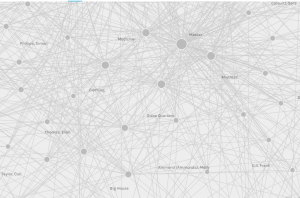
I used Palladio to map data from the Alabama WPA Slave Narratives, including interviewee and interviewer names, where the interviewees were enslaved, where the interviews were conducted, the gender of interviewees and interviewers, the types of positions held by the interviewees (e.g. house, field, or not identified), the ages of interviewees, and the topics covered in the interviews. Since I did this for a class, I had instructions for uploading the data and connecting the datasets; if I hadn’t, I might have had more trouble with this. Fortunately, Palladio has a very helpful FAQ section, which I ended up reading in order to write this post. Once the data is uploaded, it’s very easy to generate multiple graphs based on that data. The challenging part is not creating the graphs but in deciding what would be a meaningful graph. Again, because this was for a class, I had instructions for which items to choose as source and target, but I misread those once and ended up a strange, blobby graph. I’m still not entirely sure of the difference between source and target and why I would use one or the other, either, since it doesn’t seem to matter with some maps (e.g. I tried mapping topics vs. interviewee gender both ways and got the same map). On at least one occasion, the graph I was instructed to make initially appeared to be a meaningless mess – I think it was the graph for topics and interviewees – but once I began moving the topics around, to the outside of the circle, it actually became quite illuminating. I could see which interviewees talked about specific topics and then subsequent graphs of topics/gender of interviewee and topics/type of slave became much more interesting and obviously useful in terms of thinking about the WPA narratives. Here’s what that graph looked like before I started moving topics around:

messy graph created using Palladio

Graphs can be manipulated once you’ve created them. Nodes can be moved around to make the graph more clear. The graph can be zoomed in and out to tease apart connections or to see the broader picture. Sources or targets can be highlighted so as to more easily distinguish between them. Facets can be applied to the graph, so, for example, I could look at a graph of topics and interviewees and then apply a facet so I was only looking at the results for female interviewees or interviewees who had been house slaves. There are also timeline and time spans facets that I did not use and I don’t really have a good sense of what those do.

I think Palladio is designed to do a lot of thinking for the user, which can be really nice – there isn’t a huge learning curve, and I got some nifty-looking graphs out of it without doing much work. For me, though, that also meant that I had to think less and so I feel like I don’t understand as much about what it is showing in those nifty-looking graphs. A big drawback is also that because it is browser-based and you don’t have to create an account, there is not a good way to save your work. It looks like the only option is to download it as a .json file and then upload it again. There’s also not a good way to export your graphs – the FAQ recommends a screen capture (which is what I used to include the image above), but that doesn’t include the data behind the graph. I did download some of my graphs, but I’m not entirely sure how to open the file format (.svg). Overall, I feel like I need to work with this tool much more.

Mapping with CartoDB

CartoDB is a browser-based mapping tool that allows you to create online interactive maps and static maps in .png or .jpg formats. Data in many different formats, including .csv, can be uploaded, and there is also a data library of public data, which includes U.S. Census data.

CartoDB has a data view and map view. In the data view, you can view and edit the data for each of the layers. Fields can be renamed and new data added. In the map view, you can use the “wizards” feature to visualize your data in different ways – as points, clusters, heat map, etc. – and if there is a time component to your data, to animate your map by that time feature. The “infowindow” feature lets you choose which information to display about each data element. You can add features to the map, which is the equivalent of adding data in the data view. The map view also lets you run a SQL query on your data and filter it, which I did not use in this activity but are familiar to me from using ArcGIS. Maps can be annotated with texts and images by clicking on “Add Element” and a legend, title, and interactive elements can be added under “Options.” CartoDB also allows you to include numerous base maps, including your own custom basemaps (and it looks like you can also use an image as a basemap, but I’m not sure how that would work with georeferencing).

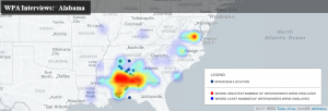
I created this map in CartoDB, which shows where the WPA Alabama interviews took place and where those interviewees said they were enslaved during the interviews. The link goes to the interactive version; this is a static rendering.

wpa_interviews-_alabama_by_mauraseale_10_25_2015_12_53_09

It was very easy to upload the .csv data and manipulate it (e.g. renaming and changing the data type of some fields). The mapping itself was also quite easy and straightforward. The wizards function is especially nice, as you can quickly see whether or not a certain type of map works for your data. The animation by time and grouping by category, which I didn’t have to do anything to set up, were useful and illuminating for certain aspects of this data, but not everything (e.g. categorizing by age). Changing the symbology on the map was straightforward, although some of the terminology was initially confusing, such as the options under “composite operation” for a simple point map. Annotating and sharing both static and interactive maps is easy, but adding a legend was less so and I found it frustrating to not be able to create a good legend for the heat map layer in this map. I wonder if the paid version makes it easier by providing legend templates that automatically draw from the layers (ArcGIS does this).

CartoDB is vastly easier to use than ArcGIS but also much more limited, particularly if you’re using the free version and can only have four layers. It does allow you to run SQL queries on your data like ArcGIS, but I don’t see any way of doing the sorts of analysis that ArcGIS lets you do (e.g. buffering, measuring distance, etc.). This isn’t necessarily a drawback – I have a lot of students who want to create maps, but for what they want to do, ArcGIS is overkill. The ability to create online interactive maps that can easily be shared or embedded, which ArcGIS desktop does not do, is another reason I will likely recommend this to students.

Working with Voyant

Voyant is a tool that allows you to discover and visualize word frequencies and trends in word frequencies across a corpus of multiple documents. After you add text to Voyant, a dashboard appears. The word cloud is a visual representation of the most frequent words and can be modified with a stop word list so that only meaningful words are included. If you click on a word in the word cloud, a “Word Trends” window will open and show the frequency of that word across documents. The Word Trends graph can be revised to include only specific documents or specific words, while the “Words in Documents” window shows the a chart of the different documents, the raw and relative count of the word being graphed in the Word Trends window, and the mean relative counts across the corpus. In the Words in Documents window, you can also search for and graph specific words and even create a list of favorites to graph words against each other. There is an analogous window to the Words in Documents window, “Word in the Corpus,” that shows the raw count and the relative frequencies for a word across the different documents of the corpus. This window can also be searched and used to create a list of favorites. In both “Words” windows, you can add additional columns of statistical information (mean, standard deviation, etc.) to the chart.

Between the Word Trends and Words in Documents windows is a window called “Keywords in Context.” This lets you briefly see how the word/s you’re graphing appear in the actual text. The “Corpus Reader” window, in the middle of the dashboard plays a similar role, but shows more of the surrounding text. The “Summary” window provides, as it indicates, an overview of word frequency information about the text corpus. It provides a total count of words and a count of unique words, the longest documents, the documents with the highest vocabulary density; the most frequent words and words with notable peaks in frequency; and distinctive words for each document.

In terms of what this tool allows you to discover, I would perhaps rephrase that as this tool allows to investigate or interrogate a corpus of texts; you might not actually discover anything. In trying to complete the activities, I had several ideas that didn’t really go anywhere, that didn’t really reveal anything about the texts. It was only when I explicitly used the Musher article and my (admittedly limited) contextual knowledge to think about what sorts of directions might be interesting or what sorts of questions might be answered by the texts that I got any meaningful results (and they are debatably meaningful). It’s important not to be limited by presuppositions about the texts, as seen in the Robots Reading Vogue project – who knew Vogue covered art and health as much as this project revealed – but having some context was important for me when I used Voyant to analyze the WPA Slave Narratives. Gibbs and Cohen echo this: “Prospecting a large textual corpus in this way assumes that one already knows the context of one’s queries, at least in part” (74). Having that context was also important in, for example, understanding that in my first pass, the list of distinctive words was almost entirely renderings of what were primarily stop words in dialect. This led me to add that list of stop words globally in order to reveal a more meaningful list of distinctive words. However, despite this more meaningful list of words and some sense of the context, in the activity that asked us to look at distinctive words and compare them, I still felt a bit adrift and ended up redoing the activity several times. One of the drawbacks with Voyant, I think, is that it doesn’t enable open-ended queries as much as something like the topic modeling done in the Robots Reading Vogue or Signs@40 projects.  
Voyant does enable “distant reading” through its statistical analyses and visualizations of words within a corpus, but a significant benefit of it is that it also enables close reading by allowing you to move between statistical charts and visualizations and the context of specific words in specific documents. This is important due to the slipperiness of language – we likely have presuppositions as to how and why words are being used, and close reading forces us to look at the specific contexts and examine those presuppositions. It’s not entirely related, but I really like Underwood’s point that search and discovery processes need to be articulated and theorized and think that an emphasis on specificity and context in conjunction with the sorts of statistical analyses afforded by Voyant do some of that work. In some ways, a tool like Voyant also forces us to remove some of our suppositions by revealing that no, that word isn’t important, but it can also enable the sort of fishing expeditions that Underwood discusses. Randomly, but entirely appropriately, when I was typing this up in Google Docs and was trying to link to Underwood’s article, Google did a search and suggested a link to an article about the country singer Carrie Underwood. So yes, algorithms have biases and context matters.