CartoDB is a browser-based mapping tool that allows you to create online interactive maps and static maps in .png or .jpg formats. Data in many different formats, including .csv, can be uploaded, and there is also a data library of public data, which includes U.S. Census data.
CartoDB has a data view and map view. In the data view, you can view and edit the data for each of the layers. Fields can be renamed and new data added. In the map view, you can use the “wizards” feature to visualize your data in different ways – as points, clusters, heat map, etc. – and if there is a time component to your data, to animate your map by that time feature. The “infowindow” feature lets you choose which information to display about each data element. You can add features to the map, which is the equivalent of adding data in the data view. The map view also lets you run a SQL query on your data and filter it, which I did not use in this activity but are familiar to me from using ArcGIS. Maps can be annotated with texts and images by clicking on “Add Element” and a legend, title, and interactive elements can be added under “Options.” CartoDB also allows you to include numerous base maps, including your own custom basemaps (and it looks like you can also use an image as a basemap, but I’m not sure how that would work with georeferencing).
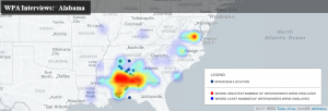
I created this map in CartoDB, which shows where the WPA Alabama interviews took place and where those interviewees said they were enslaved during the interviews. The link goes to the interactive version; this is a static rendering.
It was very easy to upload the .csv data and manipulate it (e.g. renaming and changing the data type of some fields). The mapping itself was also quite easy and straightforward. The wizards function is especially nice, as you can quickly see whether or not a certain type of map works for your data. The animation by time and grouping by category, which I didn’t have to do anything to set up, were useful and illuminating for certain aspects of this data, but not everything (e.g. categorizing by age). Changing the symbology on the map was straightforward, although some of the terminology was initially confusing, such as the options under “composite operation” for a simple point map. Annotating and sharing both static and interactive maps is easy, but adding a legend was less so and I found it frustrating to not be able to create a good legend for the heat map layer in this map. I wonder if the paid version makes it easier by providing legend templates that automatically draw from the layers (ArcGIS does this).
CartoDB is vastly easier to use than ArcGIS but also much more limited, particularly if you’re using the free version and can only have four layers. It does allow you to run SQL queries on your data like ArcGIS, but I don’t see any way of doing the sorts of analysis that ArcGIS lets you do (e.g. buffering, measuring distance, etc.). This isn’t necessarily a drawback – I have a lot of students who want to create maps, but for what they want to do, ArcGIS is overkill. The ability to create online interactive maps that can easily be shared or embedded, which ArcGIS desktop does not do, is another reason I will likely recommend this to students.
