Palladio is a browser-based tool that allows you to create network visualizations. The process for creating a visualization is fairly straightforward; you upload data and can then visualize that data on a map or as a graph. The mapping feature is not particularly advanced, but it can provide geographic context for the network graphs, which can sometimes be a bit abstract.
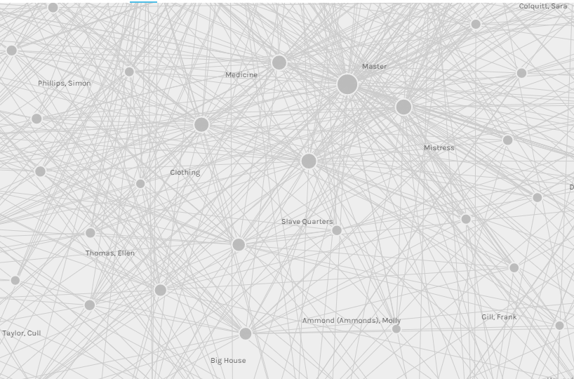
I used Palladio to map data from the Alabama WPA Slave Narratives, including interviewee and interviewer names, where the interviewees were enslaved, where the interviews were conducted, the gender of interviewees and interviewers, the types of positions held by the interviewees (e.g. house, field, or not identified), the ages of interviewees, and the topics covered in the interviews. Since I did this for a class, I had instructions for uploading the data and connecting the datasets; if I hadn’t, I might have had more trouble with this. Fortunately, Palladio has a very helpful FAQ section, which I ended up reading in order to write this post. Once the data is uploaded, it’s very easy to generate multiple graphs based on that data. The challenging part is not creating the graphs but in deciding what would be a meaningful graph. Again, because this was for a class, I had instructions for which items to choose as source and target, but I misread those once and ended up a strange, blobby graph. I’m still not entirely sure of the difference between source and target and why I would use one or the other, either, since it doesn’t seem to matter with some maps (e.g. I tried mapping topics vs. interviewee gender both ways and got the same map). On at least one occasion, the graph I was instructed to make initially appeared to be a meaningless mess – I think it was the graph for topics and interviewees – but once I began moving the topics around, to the outside of the circle, it actually became quite illuminating. I could see which interviewees talked about specific topics and then subsequent graphs of topics/gender of interviewee and topics/type of slave became much more interesting and obviously useful in terms of thinking about the WPA narratives. Here’s what that graph looked like before I started moving topics around:
Graphs can be manipulated once you’ve created them. Nodes can be moved around to make the graph more clear. The graph can be zoomed in and out to tease apart connections or to see the broader picture. Sources or targets can be highlighted so as to more easily distinguish between them. Facets can be applied to the graph, so, for example, I could look at a graph of topics and interviewees and then apply a facet so I was only looking at the results for female interviewees or interviewees who had been house slaves. There are also timeline and time spans facets that I did not use and I don’t really have a good sense of what those do.
I think Palladio is designed to do a lot of thinking for the user, which can be really nice – there isn’t a huge learning curve, and I got some nifty-looking graphs out of it without doing much work. For me, though, that also meant that I had to think less and so I feel like I don’t understand as much about what it is showing in those nifty-looking graphs. A big drawback is also that because it is browser-based and you don’t have to create an account, there is not a good way to save your work. It looks like the only option is to download it as a .json file and then upload it again. There’s also not a good way to export your graphs – the FAQ recommends a screen capture (which is what I used to include the image above), but that doesn’t include the data behind the graph. I did download some of my graphs, but I’m not entirely sure how to open the file format (.svg). Overall, I feel like I need to work with this tool much more.